Anti-design: the anti-rule book redefining digital design
“Anti-design” is the last thing you’d expect to use on a design project. But for a rising number of digital designers, it is the go-to aesthetic of choice—even if it is defined by its lack of aesthetic.
While the name might sound like an aggressive stance, anti-design is not about negativity. First of all, anti-design is not the same as anti-user. Some argue that it is the strongest advocate of the user, seeking to create memorable experiences that both respect and challenge their intelligence. It also doesn’t replace “design” with nothing. Instead, anti-design seeks to expand what design can be, encouraging viewers to reconsider what constitutes beauty and usability.

But with a name like anti-design, it should be no surprise that this is a tricky style to approach as a business—assuming it’s even worth the effort to do so. To get a better idea of what makes this style so appealing, we’re going to break down what exactly anti-design is and how it works.
What is anti-design?
—
Anti-design is a digital design approach that rejects convention and traditional aesthetics in favor of challenging, innovative layouts. Although technically it can be applied to any medium, it is currently seen as a reaction to conformity in web and app design.
There is an important distinction to make up front: the term “anti-design” is often used interchangeably with “brutalism.” But while they sometimes can look similar, brutalism has its own artistic history, goals and underlying philosophy which you can read more about here.
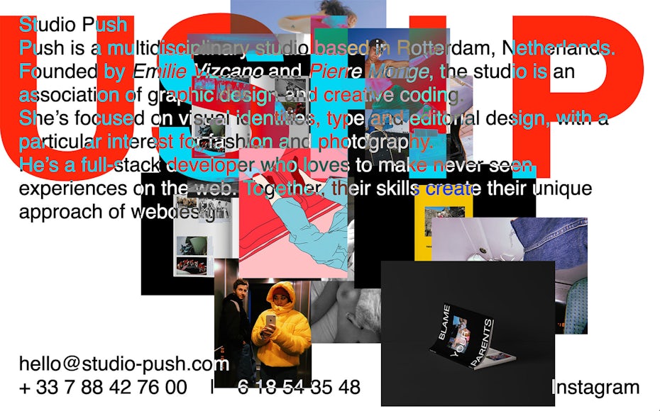
Anti-design is a bit of a misnomer: anti-design-convention would be probably more accurate, if a bit wordy. Anti-designers are not seeking destruction, or ugliness for the sake of ugliness, but to offer an alternative to accepted design standards.
As might be becoming obvious, anti-design is best defined as a way of thinking as opposed to a specific aesthetic. So let’s take a dive into the mind of an anti-designer.
The philosophy behind anti-design
Anti-design is framed as a reaction, its very name a description of what it is not. So understanding anti-design means understanding what specific “design” it is referencing.

In a word: simplicity. The key concept that drives a lot of digital design is the idea that simplicity is the pathway to a good user experience. The idea is that while users obviously want to see aesthetically pleasing websites, any distractions or obstacles to their tasks disrupt the seamlessness of the experience, and the result is a negative interaction. In other words, extraneous design features tend to serve the artist, not the user. This can be best described by Steve Krug’s classic usability book Don’t Make Me Think, where he writes: “It doesn’t matter how many times I have to click, as long as each click is a mindless, unambiguous choice.”
Anti-designers, on the other hand, argue that simplistic mindlessness is not what people want. They want experiences, meaningful interactions, mystery, the unexpected. When users think back on their most vivid memories, “simple” is the last word they’d use to describe them. And why should our digital interactions be any different, anti-designers ask. Don’t these have an effect on our psyche, our real-life interactions with other people, especially given how intertwined our everyday lives have become with the digital sphere?
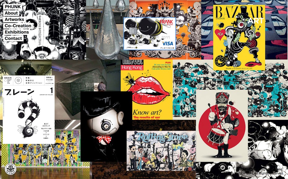
It should come as no surprise that many designers disagree with this argument. Nielsen Norman Group, for example, rejects the idea that complex, challenging layouts are desirable to any user. They point out that anti-design can only be of interest to fellow designers, as only designers can really appreciate all of the clever subversions within an anti-design piece.
But regardless of whether you agree or disagree with the logic of anti-design, this philosophy essentially describes what anti-designers seek to prove with their work. To the anti-designer, there’s nothing more dystopian than a digital environment that eliminates the user’s need to think.
The characteristics of anti-design
—
As anti-design reacts to design convention, the characteristics are not set in stone. Consider that in ten years, digital design conventions could look completely different, and anti-design would naturally change in reaction to these new aesthetics.
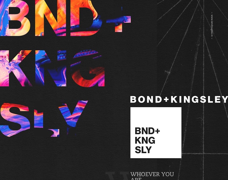
Anti-design is also all about creating a unique and authored experience. This means that the way anti-design looks will depend on the designer and what they wish to express. The most consistent trait that anti-design pieces share is the element of surprise.
With all that said, these are some of the more common characteristics we’re seeing in anti-design today:
- Asymmetry
- Overlaid and crowded text and imagery
- Clashing colors
- Lack of a grid
- Mismatched elements
Anti-design: an anti-history
—
Anti-design does not have a traditional history because it is not the kind of movement that can be pinned to one decade. In some sense, as long as art has existed, aesthetic standards have developed. And as long as those standards have existed, a new generation of artists has felt constrained by them and sought to break free. Anti-design claims to innovate, but it’s fair to ask: is anti-design itself really anything new?

There was in fact an Italian industrial design movement in the late 1960s which bore the same name: “anti-design.” Although its focus was on creating unique yet disposable furniture, it was also positioned as a reaction to the way mass consumerism had affected design standards. It is unclear whether this movement has anything to do with the current, digital trend. After all, “anti-design” is a provocative name, but not an especially original one. There have probably been creatives all throughout history that have described their work as anti-design or anti-art to shock an audience.

In the graphic design world, the tug and pull between minimalist ease and creative freedom has been raging since the immortal words: “form follows function.” One striking example of this struggle was Memphis design in the 80s. The aesthetics of the 90s in particular seem to have had an impact on anti-design as it is now—no surprise, given that this same decade witnessed the birth of the Internet. With no design rules yet established, even the most high-profile companies produced gaudy, baffling websites.
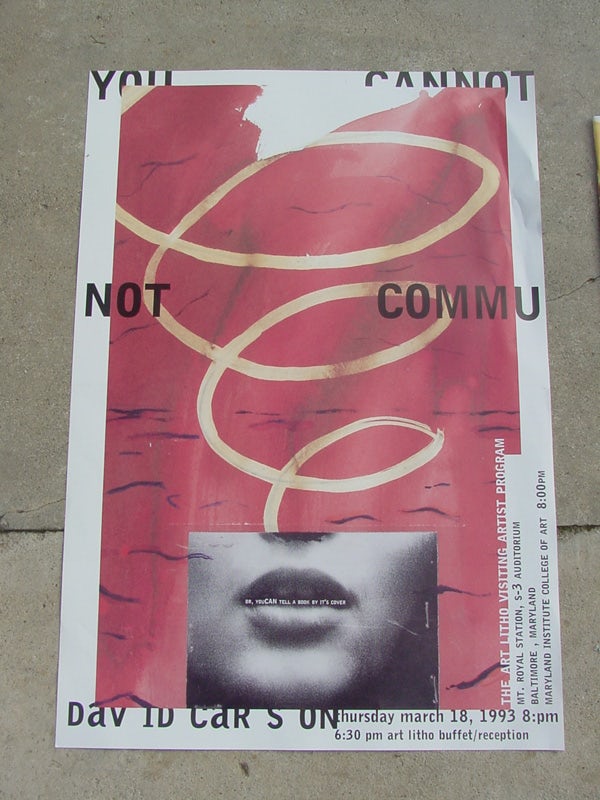
But this was also a time of innocence and creative experimentation for the Internet—all under the backdrop of angsty grunge and design giants like David Carson, whose tenure as creative director of Ray Gun magazine was defined by crowded typography and challenging visuals. By the 00s, small mobile phone screens were here, and UX simplicity arrived to reign everybody in.
And that of course, brings us to today: to the grid and material design. Although there are small variations from website to website—in terms of color, imagery, and text—when you strip it all down, the entire Internet seems to be based on a handful of standard layouts. Anti-design has now proposed an answer to this stagnation.
All in all, you might be tempted to say that, through the term “anti-design,” the youth of today are simply pretending to have invented something that has always existed: namely, iconoclastic art. But the advent of digital technology does make this particular iteration of anti-design subtly different from all the others. We’re no longer just talking about aesthetics but usability—users have to be able to perform tasks through these digital programs. It’s like a government trying to get away with avant garde tax forms. All the same, anti-designers insist that there is more than one way to achieve ideal usability.
How and when to use anti design
—

Now the million dollar question: does anti-design succeed in proving that users can handle challenging layouts? Are there any good reasons why a business would choose to reject simplicity and comfort? As with anything, it depends on a number of factors—namely the project, the audience, and the designer’s overall intentions.
There are, of course, a number of superficial reasons to employ a subversive design strategy: to be provocative, ironic, and even trendy. But what are some more genuine reasons why anti-design can be good design?
For engagement
Websites that present mysterious layouts can inspire users to interact with them in order to uncover their secrets. This approach requires attention to animation and interactive design to provide the user with something mysterious they will want to explore.

For example, Studium Generale’s anti-design website for their Take a Walk on the Wild Side campaign presents the user with a busy screen. But when the user’s mouse movements trigger parallax animations, page elements shift around to establish a foreground/background relationship, which is much easier to decipher. This introduction also prepares the user for how simple mouse movements will be used for other animations on the site, like scrolling. The result is a website that not only offers a challenge, it quickly and subtly acclimates users to its unconventional navigational style.
For memorability
Cookie-cutter websites might be intuitive, but they are also forgettable. Anti-design, on the other hand, can offer a memorable interaction.
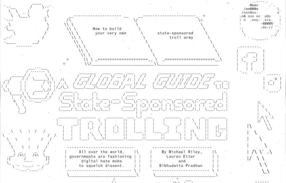
To aim for the good kind of memorability, design your site with intention and logic. After all, anti-design doesn’t mean random design. It should look the way it looks for a purpose, with each element contributing to an experience, as idiosyncratic as that experience might be. For example, Bloomberg’s “A Global Guide to State-Sponsored Trolling” provides a memorable header that sets it apart from other newspapers.
For brand alignment
Design, even anti-design, communicates something about your brand. As previously mentioned, anti-design comes with an entire philosophy attached to it. So if a rejection of mind-numbing simplicity and homogeneity, a willingness to craft experiences that are meaningful and original sounds like your brand, then anti-design can be a good fit.
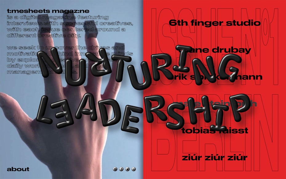
For example, Timesheets Magazine is a digital magazine focused on creative fields around the world. Their focus on the creative process makes their brand a great fit for a website that takes artistic liberties.
The limitations of anti-design
—
Anti-design is intended to be an experimental style—that’s part of what’s so great about it. But that also means the results are not always going to be expected or ideal.
Here are some common challenges to be aware of when considering anti-design for a project.
Accessibility barriers
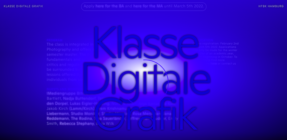
There is always a risk that anti-design will be disorienting and non-intuitive for most casual users—often that’s exactly what it’s going for. But challenging layouts can also be difficult to make accessible for people with real handicaps. For example, you might have a clever, subversive reason for using crowded text, but consider how a person with a visual impairment would experience that.
Lack of scalability
Say you’re building a large website with many pages. When you create new pages or entire new areas of the site, you need to be able to build them quickly in a way that incorporates seamlessly with the existing site design. There can also be several designers working on the same site, and pages from multiple designers must look cohesive.
This is why many web designers use a modular or template-based approach. Anti-design, seeking novelty and surprise, is diametrically opposed to modular design, which means it’s not the best fit for large scale websites. It can, however, be useful for one-off campaigns on bigger sites. For example, Adidas used an anti-design campaign to promote a specific product, their Yung-1 Alpine Sneakers.

Obnoxious trendiness
As subversive as anti-design attempts to be, it is a trend—like it or not. This means it can sometimes make brands look like they are trying too hard to be youthful and hip, like this guy. Trends also change and can become dated very quickly. What’s subversive today can be tired and conventional tomorrow.
Become an anti-designer
—
Anti-design is not seeking to destroy but to create. Its goal is to revitalize digital screens, to remind people that websites and apps can still be useful while being meaningful, mysterious, and complex.
That said, anti-design is a bold and daring style that will not work for every brand, depending on the nature of the business and the audience. If you are unsure of whether an anti-design aesthetic is right for your website (and how to get the most out of the style if it is), the best person to consult with is an expert designer (that is, anti-designer).
Want to revolt against the rules with your brand identity?
Our talented designers are here for it.
The post Anti-design: the anti-rule book redefining digital design appeared first on 99designs.