Firefly’s Serenity Was Designed To Be The Opposite Of A Star Trek Ship

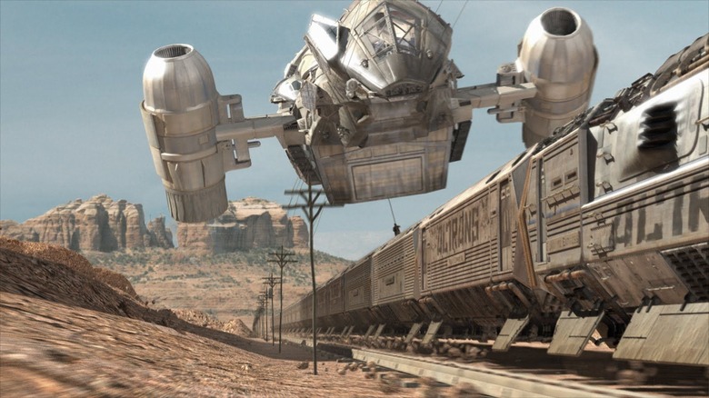
Based on the short-lived but incredibly beloved cult TV series "Firefly," Joss Whedon's 2005 film "Serenity" is saddled with pretty complicated mythology. Set in the 26th century, a distant solar system has been largely terraformed, and those living on the planets closest to the sun live in bliss under an all-powerful organization called the Alliance. A viewer will get no points for guessing that the Alliance isn't entirely good, and that there is a great deal of corruption at play. Also, crime and poverty still exist on some of the solar system's outer worlds, to the point where they look a lot like the Wild West, with characters on horseback and high-tech trains that speed through dusty mesas.
The main characters of "Serenity" are the brown-coated crew members of the title ship, a craft populated by former Rebels and malcontents who have turned to smuggling to survive. Fans of "Firefly" will recall several descriptions of the Serenity as a clunky-but-functional craft that is especially conducive to smuggling, as it has myriad secret compartments built into its structure. It has two outsize jet engines on either side, is small enough to soar around in a planet's atmosphere, and its pilot sits in a beak-like, bird's head-shaped compartment.
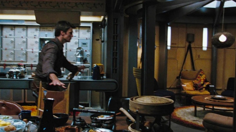
The interior of the Serenity is uncomfortable, angular, and metallic spaces lined with wrought iron stairways and catwalks. The mess hall is cramped, and only one person has inhabitable-looking quarters.
Whedon and co-author Abbie Bernstein explained in their 2006 book "Firefly: The Official Companion" that the Serenity was designed to be more utilitarian than comfortable, specifically to evoke an Old West covered wagon. Unlike the ships on "Star Trek," which are slick, bright, technological marvels, the Serenity was essentially a big rig.
The Anti-Enterprise

For Whedon, it was crucial that the Serenity remain small. Production designer Carey Meyer helped come up with the layout of the ship, and Whedon felt that having too many spaces inside of it would be antithetical to the outsider nature of the characters. Indeed, when one thinks of, say, the U.S.S. Enterprise-D from "Star Trek: The Next Generation" -- the model Whedon was clearly and deliberately deviating from -- one doesn't necessarily have a good plan for getting around its many, many hallways and research centers. Over a thousand people live on board that ship. If a Trekkie were to project themselves onto the Enterprise-D, they would have to rely on the ship's computers just to find their way back to their quarters or to one of the ship's many relaxed, recreational areas.
Whedon wanted viewers to see the Serenity, and feel like they could move around its cramped interiors, no maps required.
"The design of the ship is something that I worked on very hard and then Carey Meyer worked on very hard. To me, the design of the ship was very crucial just in terms of the idea of a known space; the idea of, 'We live in this space, and here's where the rooms are, and here's why, and here's where the cargo bay is, and here's why,' and there are not fourteen hundred decks and a holodeck and an all-you-can-eat buffet in the back. It's very utilitarian."
For the record, the Enterprise-D only has 42 decks, and the all-you-can-eat buffet is likely just the replicator in your room, but one understands Whedon's meaning. The Serenity isn't meant to be cushy, nor expansive.
The Flying Dorm Room

The Serenity has a very "off-campus housing" vibe. With its picnic table mess hall, area rugs, and cluttered "hang out" spaces, it feels like a college student decorated it. Whedon, meanwhile, said that he looked to a famous John Ford movie when it came to his thinking of the ship's design, saying that "If you actually watch 'Stagecoach,' they spend a long time introducing the stagecoach because that space is very important."
Whedon also noted that the various rooms on the Serenity were carefully color-coded to match the character that spent the most amount of time in them. The earthy engineer Kaylee (Jewel Staite) had a motif different from the steely doctor Simon (Sean Maher), for exampble. He even knew how to color the set when no character was meant to inhabit it on the regular.
"I knew everything I was looking for and which space related to which character. We spent a lot of time talking about paint. Because you're going into this knowing you're going to spend most of your time on the ship, and every room represented either a feeling or a character. The engine room was rusty brown because that's very earthy and likable and real, and that's Kaylee's space -- that was very deliberate. The hall next to it is very cool and blue, because that space doesn't really serve a purpose except for action or suspense. Everything was done exactly like that. Obviously the blue of the infirmary is like Simon."
Compare this aesthetic ethos to "Star Trek," and you'll find the ship comes first with its inhabitants entering later. "Firefly" was an antidote to "Star Trek." Indeed, if it wasn't obvious, the Alliance may be said to be a satire of the Federation.
Read this next: Sci-Fi Movies You Never Realized Were In The Same Universe
The post Firefly's Serenity Was Designed To Be The Opposite Of A Star Trek Ship appeared first on /Film.