Singular simplicity
For a celebrity chef who honed his craft at Noma and Rockpool and now helms Vue de monde, one of Australia’s most inventive fine diners, Hugh Allen is unexpectedly easy going and low-key.
Project
Arnold Street
System
Tableau Kitchen System
Service
Kitchen Renovation
Location
South Yarra, Melbourne
Images
Tess Kelly
Written by
Kath Dolan
Key Suppliers
Miele
Artedomus
Make Designed Objects
So much so that when Cantilever Director Travis Dean first met him in the Brunswick showroom for a laconic chat about the compact kitchen he was renovating, he had no idea Hugh was one of the country’s most exciting young chefs with a design sensibility as natural and refined as his renowned cuisine.
“Hugh was so relaxed and chilled out, nonchalant in some ways, I didn’t really take him that seriously,” Travis recalls with a laugh. “He wandered in, went straight to Tableau and said, ‘I love this kitchen. How does it work and what does it cost?’ To be honest I didn’t expect to hear from him again. Often with younger people the budget doesn’t marry up. When I saw the email address was Vue de monde and realised he’s the executive chef there I thought, ‘Okay, maybe there’s something in this and it’ll keep progressing’.
It sure did. And not a moment too soon.
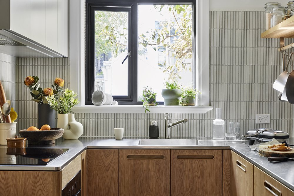
Hugh was already partway through an extensive renovation of a dilapidated Art-Deco apartment in Melbourne’s South Yarra. “It was a real dump when I bought it,” he says. “But I was always excited about the renovation and design part. It’s near the Botanical Gardens and I’ve always loved the area. It’s a small space so I wanted to optimise it. The kitchen is in the centre of the flat. It’s the first room you walk into when you enter. I decided to turn a bedroom next to the kitchen into a living room, and remove the adjoining wall to connect them and create a kitchen/dining space.” By the time he visited Cantilever’s showroom, work on the compact 2.6 x 2.3-square-metre kitchen area had already begun, including a double-width wall opening into the new living space and a new double-glazed window to admit gorgeous natural light and leafy vistas.
For Cantilever the timing had its challenges. “Usually we like to be engaged a long time before the builder gets on site,” Travis explains. “When projects aren’t led by design they tend to fall short. Ideally we talk with clients early, before they even start talking to builders or buying appliances or tiles. If people come in after they’ve ripped their old kitchen out and put new flooring down, for example, it limits our ability to move services.”
“The kitchen is in the centre of the flat. It’s the first room you walk into when you enter”
Talking with clients at the start of the design process helps the Cantilever team understand the project’s drivers and flesh out a brief that nails daily needs and longer-term goals. “It takes time to unpack what’s important to clients,” Travis says. “What their values are, what drives their day-to-day use of the space, what’s important to them in a kitchen. We consider their cooking habits, their social habits, and whether or not they’ve got kids or grandkids. When they entertain how does that work? We also look at the kitchen as part of the capital value of the house. Is this a forever house, or in 5 or 10 years are they going to move on? If it’s a forever house you can do whatever you want in terms of colours. But if you’re moving on in 5 years we might go for a palette with broader appeal so we don’t scare off potential purchasers.”
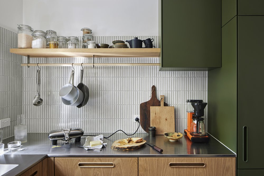
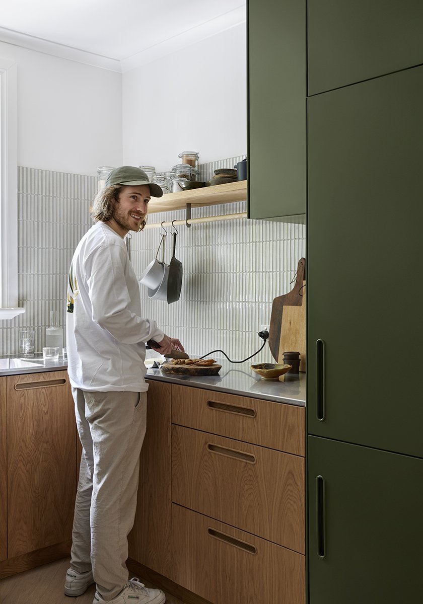
In Hugh’s case, although the briefing process began later than usual, the kitchen’s compact scale largely dictated service placement, and the chef had a brief that was characteristically pared back, considered and crystal clear. “I actually left most of the design to Cantilever but I had a few requests,” Hugh recalls. “I wanted an open shelf for dry store (pantry storage). I think I’m just used to things being organised and on display in commercial kitchens. Also, because it was a small space, I didn’t want heaps of cabinets. I wanted a rod to hang equipment off, more for aesthetics than anything. Otherwise I just wanted to use woods, green tones, and have a stainless steel bench. Cantilever has a range called Tableau that basically fitted the bill perfectly.”
[TAG4][TAG5]
[TAG6]“It takes time to unpack what’s important to clients, what their values are, what drives their day-to-day use of the space, what’s important to them in a kitchen”
[TAG7]
Quality and simplicity were the only items on the menu. “Unfortunately I rarely have time to cook at home,” Hugh concedes. “But if I did it would always be something super simple.” Let’s be clear: his take on simplicity is more sophisticated than most after a decade travelling and working at some of the world’s best restaurants, including formative years with mentor Rene Redzepi at legendary Noma: the Copenhagen original, Sydney and Mexican pop-ups, and reborn Noma 2.0. At Vue, Hugh’s endlessly Instagram-able dishes combine lesser-known or underrated native ingredients, exciting seafood, and fresh, local, seasonal abundance. “A big taking from working at Noma was cooking with a sense of time and place,” he says. “Meaning using the best ingredients from where you are, and using them in their peak.”
At Vue, Hugh’s well known for his deft touch, constructing striking dishes using a few exquisite ingredients, simple forms and stunning tableware of natural materials like timber and stone. That approach is evident in his home renovation too. He understands the power of simplicity to focus attention, gravitates towards natural textures and tones, and makes confident aesthetic choices. “I’ve always enjoyed photography and design – graphic design and interior design,” Hugh says. “There are no other careers I’ve ever thought seriously about doing. But occasionally I think about what else I might have done or been good at. I think maybe a furniture maker using stunning Aussie woods.”
Travis may not have recognised his famous client from his Masterchef appearances on their first meeting, but he noticed his design nous. “People choose the kitchen range they connect to,” Travis says. “Because of Hugh’s background, and I guess maybe his European experience and exposure, he’s obviously attracted to quality materials and quality detailing. He walked in and went straight to Tableau, and he never moved to the other kitchens. There was a confidence about his decision-making.”
[TAG8][TAG9]
“Tableau tends to appeal to people who are interested in design,” he says. “I think that’s connected to the designers we developed it with, DesignOffice. It’s highly crafted and has furniture-like detailing. Solid FSC American Oak timber corner radius detail on the end panels, for example. Lozenge-shaped handles that are machined in multiple steps out of a solid block of FSC American Oak and hand-fitted in the workshop. There’s a lot of machining and bench work involved in fitting the handles – sanding, getting them ready for polishing. Given Hugh’s interest in craftsmanship and furniture-making I imagine that’s the sort of detailing that attracted him to Tableau.”
Hugh’s clarity with his design preferences informed his discussions with Travis about how best to adapt elements from the Tableau range to his space. “We’ve had clients who are chefs or really into cooking, and there are a lot of conversations around appliances and how they are going to cook in the kitchen,” Travis says. “With Hugh it was more about the design elements. He was really big on keeping it quite minimal. I wanted to close off a door and extend the kitchen to make it bigger. But he didn’t want to do that.” Nor was he tempted to fill every gap in the compact space with cabinets, which most people instructively would. “He was strong on that, which I really liked because it made the kitchen work,” Travis says. Hence opting instead for a single floating timber ‘dry store’ shelf with pot rail below. His preference for earthy green tones made his choice of 2PAC Dulux Algae for cabinetry finish a no-brainer.
“I don’t cook there nearly as much as I’d like to but it’s still the most important part of any home”
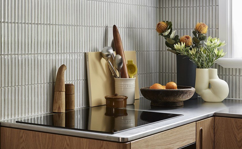
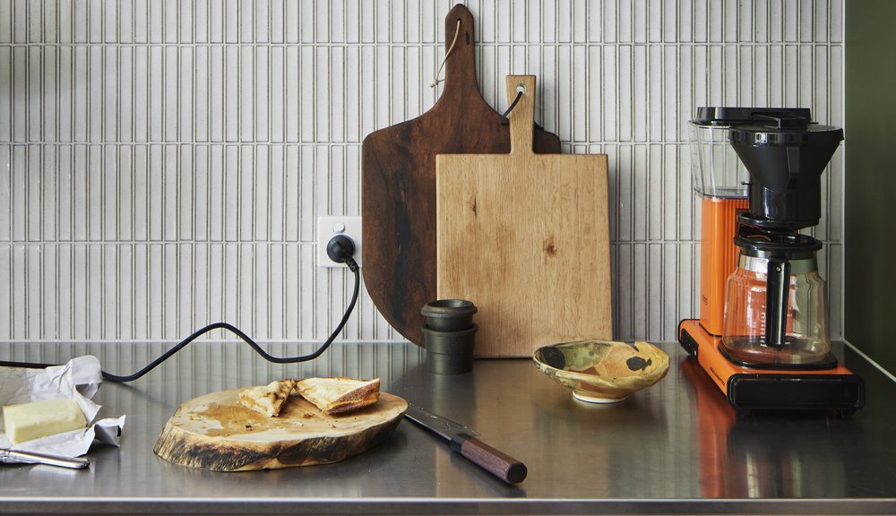
Stainless steel benchtops were another sign of a chef who knew his mind and felt utterly at home with commercial kitchen utility. “We find stainless steel to be quite a polarising benchtop material,” Travis says. “People either love it or they hate it. If they work in hospitality or hospitals they often don’t want them because it reminds them of work. They want more natural or domestic finishes. Whereas Hugh wasn’t like that at all. He said, ‘I love stainless steel – it’s easy to clean and durable.’ It also has really strong anti-bacterial qualities, everything gets integrated so there’s no silicon joins, and it’s indestructible. We find when people have had a stainless steel benchtop, they often will get it again.”
For Travis, Hugh’s practical, considered and relaxed approach made this design collaboration interesting and a genuine pleasure from the get-go. “The main complexity in this project was dealing with the broader renovation underway,” he says. “Dealing with Hugh was incredibly straightforward. He made it really simple, enjoyable and easy.”
For Hugh, the new kitchen is amongst his favourite features of the reno. “I don’t cook there nearly as much as I’d like to but it’s still the most important part of any home,” he says. “The whole reno is a highlight really, but I especially love a new painting by artist Baden Croft, the herringbone flooring by Kustom Timber, the kitchen by Cantilever, and a dining room table made for me using a local slab of Cyprus pine, which is truly stunning.”