The Micro Trend That Found Its Way Into This Design Creative’s Baby Blue Kitchen
We may earn revenue from the products available on this page and participate in affiliate programs.
In mid-2019, Sight Unseen cofounder and editor in chief Jill Singer noticed one of the strangest micro trends she’s ever seen: furniture with tiny balls. Upon further digging, she discovered “it’s very steeped in design history—it goes back to the Wiener Werkstätte workshops and the 1920s and ’30s,” she explains. Around this same time, it just so happened she was embarking on a two-phase renovation of her family’s Hamptons home, which she had tasked Keren and Thomas Richter, the designers behind White Arrow, with executing. So when Keren proposed a new kitchen banquette with delicate iron-ball feet, Singer couldn’t resist. “I was so tickled,” she says.
The Scandinavian touch—Keren was inspired by Swedish furniture maker Greta Magnusson-Grossman’s mid-century pieces—is a far cry from the country cottage vibes the white cabinets and tiled countertops were previously giving. For the Richters, a dining area for Singer and her family to gather in was crucial, but so was increasing the room’s overall functionality. Enter: a spacious walk-in pantry and larger appliances, all in the home’s joyfully retro style. “You understand that it’s a beach house, but it doesn’t hit you over the head with the cliché things,” shares Keren.
Blue Clues
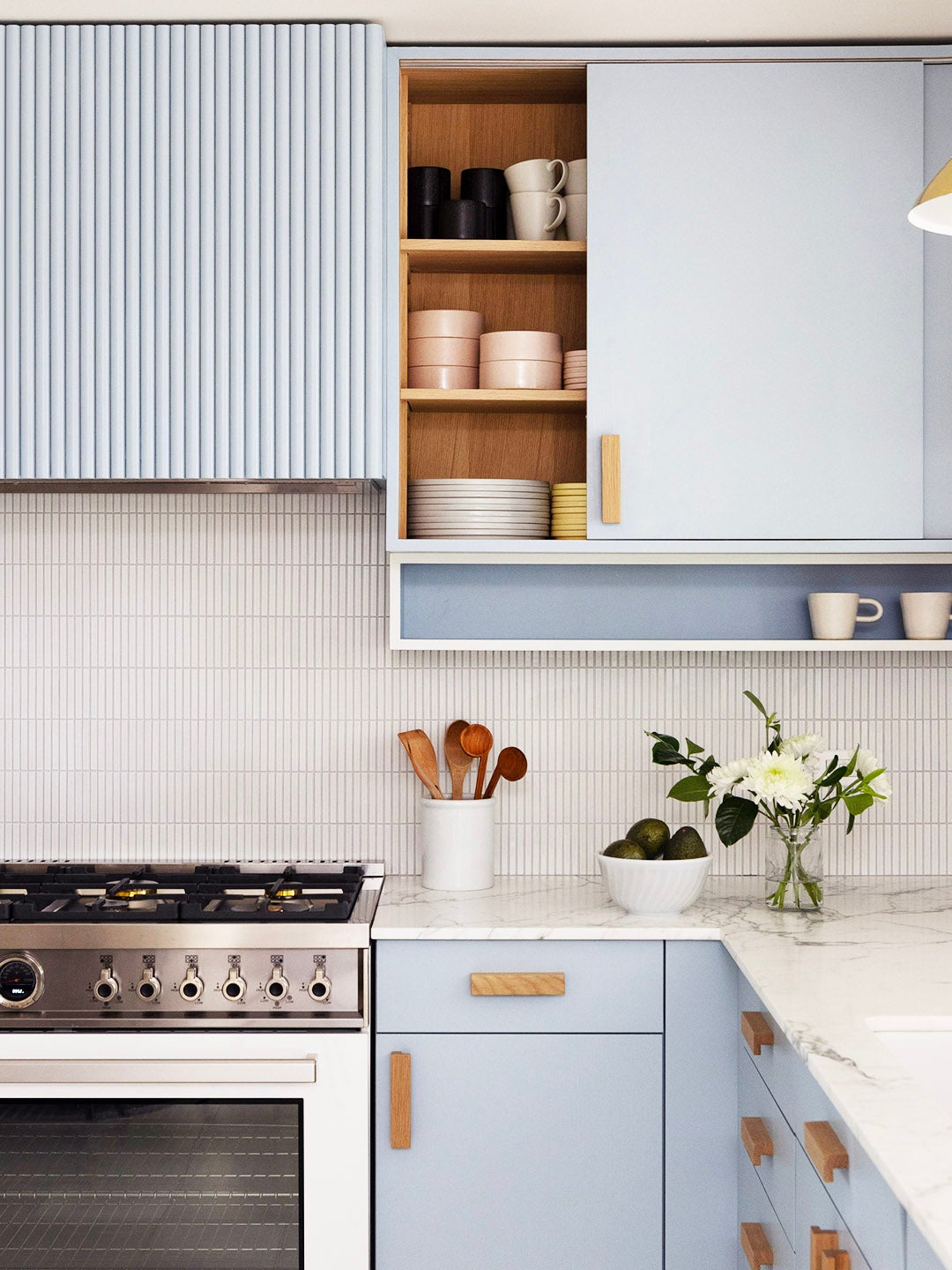
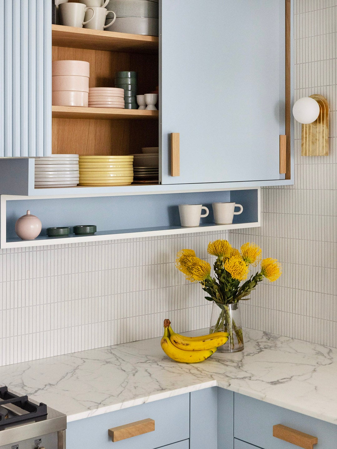
Before embarking on the remodel, Singer took a pulse check. “I was seeing the design world go through a dark green kitchen phase, and I thought sky blue might be on the horizon,” she says. The idea was sealed when she spotted the Ganni founders’ Copenhagen home on the Internet—it’s practically dripping in shades of baby blue. What if the hue veers into trendy territory one day? The creative admits it doesn’t really bother her, “but I don’t necessarily think it has at this point,” she adds.
White Arrow pulled a paint color called Hazy from Kelly Wearstler’s California-inspired collaboration with Farrow & Ball that evokes breezy, beachy living. “When a friend of mine first saw my materials palette for the kitchen, they referred to it as ‘elevated ’50s Hamptons,’ which I really like, because it does feel sort of mid-century,” says Singer.
Sliding Doors
Another nostalgic element? The sliding upper cabinet to the right of the vent hood. The setup was really a solve for the fact that Keren wanted to put a Naama Hofman sconce on the adjacent wall, but it also lent the 1930s, Bauhaus feel she was after. “There were some cool kitchen cabinets I’d seen in museums and interiors while visiting Europe that made everything in a small kitchen feel well appointed,” she says. “Often there’d be a sliding door that made everything easily accessible.”
Not So Lazy
By investing in larger appliances without changing the general footprint of the kitchen, Singer technically lost storage space during the process. It didn’t help that the contractor forgot to build in the lazy Susan she had initially requested. “But the space is so much nicer in terms of entertaining,” she says. Slotting in small but deep cabinets and cubbies like the one above the refrigerator went a long way.
Completing Singer’s dream banquette across the way: a cabana-striped indoor-outdoor cushion and a tubular white leather backrest. The team carried the emerald green hue onto the custom dining table, made by Singer’s friend Steven Bukowski, in collaboration with Hannah Bigeleisen, with a simple band of color underneath the bleached maple top. “I really wanted big pieces that I have a personal connection to,” says Singer. The Beata Heuman pendant light overhead is fixed on a pulley system so it can be raised or lowered if needed. “Everyone tries to squeeze into the banquette because it’s so cozy,” says Singer. “I’ll work there sometimes during the summer; we’ll all eat breakfast there; my daughter really likes to bead at the table.” Its little balled feet might be tiny, but through dinner parties, WFH, and craft projects, they’ve proved their might.
The post The Micro Trend That Found Its Way Into This Design Creative’s Baby Blue Kitchen appeared first on domino.


