‘The Willoughbys’ Director Kris Pearn is Blending 2D and Stop-Motion Animation Styles for a New Take on an Old Story [Interview]
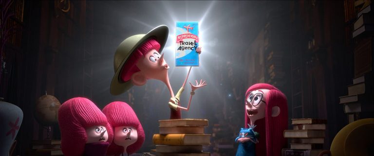
There’s something about The Willoughbys, Netflix’s new CG-animated family film based on the Lois Lowry children’s book, that looks a little old-fashioned. But director Kris Pearn doesn’t mind. In fact, that was his intention. Down to the yarn-like bright red hair that covers the heads of the Willoughby children, the intrepid protagonists of the family adventure, to the jittery character movement that mimics stop-motion animation, Pearn wants to use computer animation as a tool to give the film the same feeling as 2D and stop-motion animated films.
“I started off my career as a 2D animator,”Pearn told /Film in a phone interview. “And I think, for me, the craft of the art form of animation is often less is more. The computer does ‘real’ very and so one of the tricks in trying to make it feel handmade is using that as a tool.”
/Film spoke with Pearn to speak about The Willoughbys, how he tackled an “old-fashioned story” that feels like it came right out of a Roald Dahl book, and what a stylish and inventively animated film like his could mean for the future of CG animation.
What drew you to do an adaptation of Lois Lowry’s The Willoughbys?
Oh, it was 2015 and I met with the producer Luke Carroll. And I was doing a project here in California and he had just optioned the book and Ricky Gervais was actually already attached. So there was a little bit of momentum to the project. But I think for me, when I read the book, what I really loved was just how Lois Lowry was being subversive about the tropes of children’s literature and this idea of like, making fun of, I think some of the things that we take for granted when it comes to that kind of storytelling. So when I pitched it back, my elevator pitch was, you know, what if we took Grey Gardens collided with Arrested Development for kids? And they immediately jumped on that and they thought it was something to try.
For me, I think this idea of a subversive story that we pivoted from children’s literature to children’s film, but in a way, [it’s] trying not to parody other films. You know, that’s been done very successfully in the past, but to tell a story [about] the independence of children in tricky situations, but still finding kind of optimism and humor and their journey and then using the animation tropes as a way to develop that felt really fun.
And the tropes that you’re speaking of, are they the kind of like those old fashioned ideas that come from, for example, a Roald Dahl book?
Definitely. And like really not pulling punches on sort of like, the way Roald Dahl always kind of looked at the world from that children’s point of view, which is somewhat larger than life and extreme. Just finding humor in bad guys and looking at the world. Bad things can happen. But in finding the fund in how the characters get in and out of situations. I love that. That’s really chewy, making these things.
Yeah, I have to say I was a little bit surprised when watching the movie about how dark it got. But they had that kind of macabre darkness to it where it was a little bit tongue in cheek and you kind of see it from the children’s point of view where it’s not as scary as it as it would be for adults watching it. So how did you like strike that balance with some of the darker moments that are more common with those older old-fashioned stories and bring that to a modern audience?
One of the things I did, when I first started to explore the visual style of film, I partnered with a friend of mine who I’ve known for years, Kyle McQueen, he’s the production designer. I really wanted to always undercut any of the darker themes or the more spiky ideas in the story with the permission to be a comedy and this idea of making sure that the world always felt fun and bright and textured. It was really important, I think to maintain that tone.
And so the idea of like making it a cat’s tale and leaning into that point of view where everything feels a little miniature, I think for me creatively what it is allowed us to always be in a “once upon a time” sort of space. So the film always felt like a parable. It wasn’t a documentary, we didn’t want it to be a documentary. And I think that to me, is what — when you read a Roald Dahl book and you have the Quentin Blake illustrations — there’s always something funny in the darkness and I think that allows it to sort of make its message and have its conversation with the audience. So that was that was really important: from animation, movement, to how the music is built. [Composer] Mark Mothersbaugh always made sure that the parents didn’t feel like the bad guys. The bad guys sound like they’re just returning from the war and it’s a Guy Lombardo/Benny Goodman score. So basically that that the optimistic home undercut some of the darker stuff, which I think makes makes the film sort of feel interesting in a funny way.
Speaking of the texture of the film, this has such a unique animation style. With Netflix stepping up its game with CG-animated films like Klaus and now The Willoughbys, what was your vision when you were creating that animation style for The Willoughbys?
I started off my career as a 2D animator. And I think, for me, the craft of the art form of animation is often less is more. The computer does “real” very and so one of the tricks in trying to make it feel handmade is using that as a tool, from camera choices — like when the kids are in the house, I really want it to feel like a sitcom so we reuse camera setups and [didn’t move the] camera unless we actually had to, and that gave us that sort of miniature feeling. And then combining that with an animation style that’s really pose-to-pose. What I mean by that is like, in the old days we would draw on paper, because you know, people were drawing these things by hand. We would draw key poses and then other artists would fill it in. So I wanted to approach you know how we looked at the animation style from that posing standpoint.
It’s going to sound mechanical, but when we were even noting on animation, we would note unblocking very early on, and really just try to pay attention to how those poses are working. And then that allowed us to really distill and boil down how the character movement added to their personality so we could really pull out ideas. Like Tim is a kid who’s probably grown seven inches in the last two months and doesn’t know his own body, but he’s trying to be a grown up. And so we gave him that kind of John Cleese posture. All of that sort of caught in the collision of reducing the movement. Adding up with the textures that [production designer] Kyle McQueen was creating gives us an interesting style, which is sort of between stop motion and classic 2D animation.
I actually quite notice the stop-motion style like that kind of almost staccato movement, like a jittery-ness to some of the motion. And I really enjoyed that aspect. I feel like you kind of touched on it, but how did you achieve that kind of that motion in a CG animation?
It really is just taking stuff out. So we didn’t have motion blur. When we have our key poses — say you had like frame one and frame 12 — with the computer, normally you would be filling the 10 frames in between one and 12. And we would just have it fill in every other frame. If you watched the old Disney animations like The Jungle Book or 101 Dalmatians or what have you, a lot of those are animated on twos. And so that that gives it that look and sort of edge of your persistence of vision. So you don’t quite perceive the staccato, but it is there. And I think It just gives them a really interesting feel. Then we sometimes accent it too, like if you see a scene where there’s a fire in the background, we would put the fire on threes or fours. And so while the characters are moving on two’s, you have this element that feels like it’s sort of superimposed. If you watch the old stop-motion [movies] likes a The Nightmare Before Christmas, where they wind the film back and then shoot it again at half exposure for say, the ghost dog. I wanted it to feel like the effects are kind of done that way. And so ultimately, having a different timing for the effects of the characters kind of gives you a feeling like the film was rolled back and reshot again. I think subliminally it kind of gets into that feeling, even though we’re just tricking a computer.
What would you say would be the biggest aesthetic influences on this movie? Because I know you talked about Grey Gardens meets Arrested Development for the plot, but it seems like you drew from all sorts of different animation like stop-motion and 2D animation to create the unique look of this movie.
I think it’s funny because I think a lot of times when you’re making a film, the reference points are a bit more kind of real. And like, you know, for example, the Willoughby house is a museum in my hometown of London, Ontario, which is a, colonial family that collected all these artifacts from all over the world. It’s like people went off to the Boer War, or like, over different places where the British Empire spread and brought all this stuff back. And that was a huge influence on the house. This idea of the Willoughby’s place that’s not home, but a museum, that came from observations from where I was living at the time. I think the idea of boiling stuff down and those design choices, all of those come from where we cast. We hired Craig Kellman as our lead character designer, so his influences come from the idea of reducing line work and telling as much story with as little shape as possible. I think all of that sort of built into the style that we created, but there was definitely a lot of looking around the world and trying to make sure [our animation] was clear and honest to what the characters needed.
Continue Reading Kris Pearn Interview on The Willoughbys’ Animation Style
The post ‘The Willoughbys’ Director Kris Pearn is Blending 2D and Stop-Motion Animation Styles for a New Take on an Old Story [Interview] appeared first on /Film.